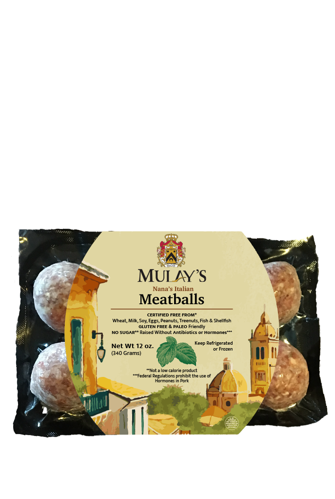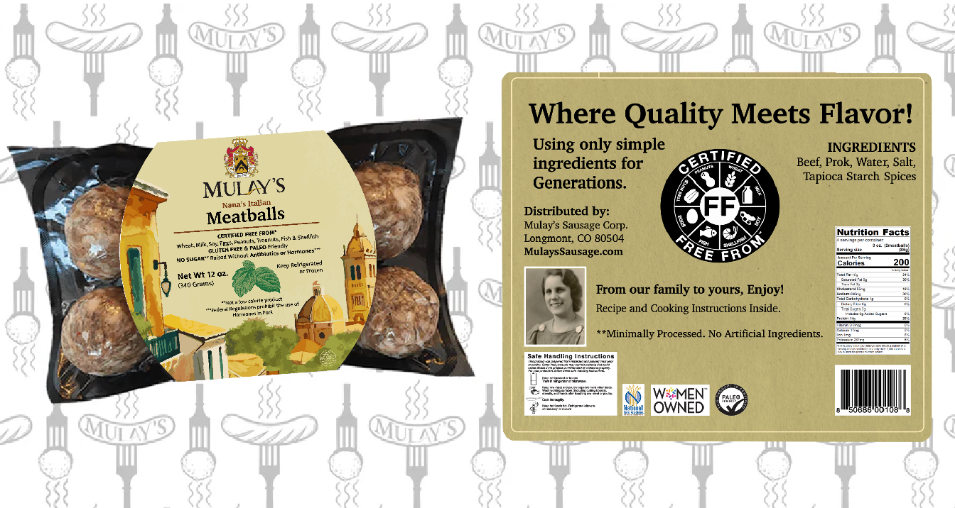
MULAYS
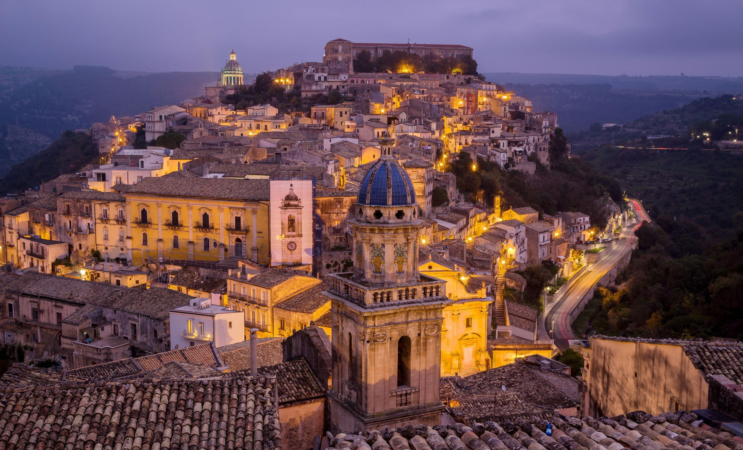
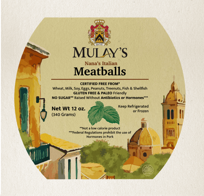
Throughout researching the Mulay’s brand, I felt they consistently represented the fat that they are family run; not to mention, women owned. Therefore, the main story revolves around their culture and how their products are home-grown. My design showcases a scenery based off of Sicily, Italy, the location where the Mulay’s Nana’s Italian Recipes originated.
THOUGHT PROCESS

FONTS:
CHARTER: a good base to create a professional, elegant concept while also feeding into my story-telling illustrations. The second font, Mukta Mahee paired well and had good legibility.
COLORS: Orange, brown and green tones were used to create a scenery. giving a very natural and harmonious appearance.
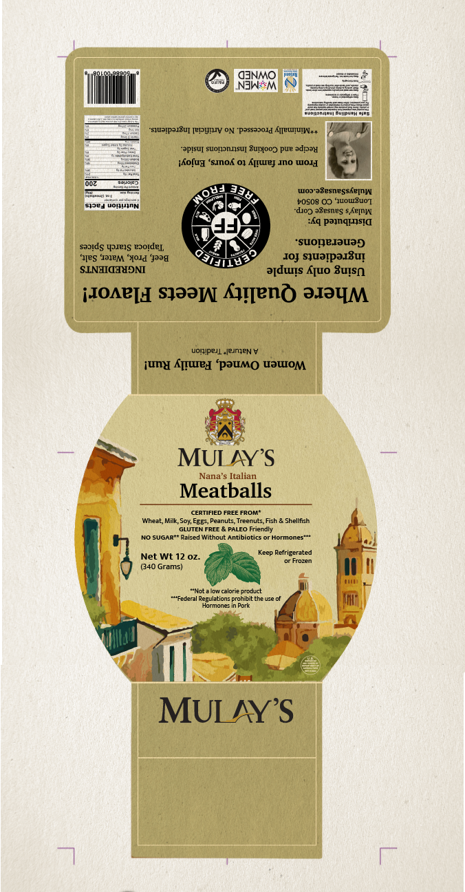
CULTURE HOME-GROWN NATURAL
CULTURE HOME-GROWN NATURAL
MOCKUPS